
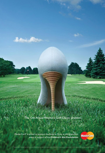
The image above is an advertisement created and published by MasterCard around July 2012. It was created to promote the 12th Annual Women’s Golf Classic, hosted by the Children’s Aid Foundation at the Angus Glen Golf Club in Markham, Ontario. It will be used as a reference to analyze each element of the design and what makes it effective. The link to the image can be found here: https://www.adsoftheworld.com/media/print/mastercard_womens_golf_classic
All credits go to:
Advertising Agency: MacLaren McCann, Canada Creative Director: Sean Davidson Art Director/Group Creative Director: Robert Kingston Copywriter: Ron MacDonald Print Producer: Steve Ferreira Photographer: Paul Weeks
The Analysis:
1. Contrast– There is a distinguishable contrast between the objects in the background and the shoe in the front, which is the focal point of the image. The size of the shoe is heavily emphasized to draw a viewer’s eye in. The shoe’s heel also shows horizontal patterns to stand out from the vertical outlines of each element. Additionally, the logo’s colors of bright red and yellow protrude from the background’s earthy colors. Some of the written texts are also emphasized in bold to help readers focus on important information.
2. Alignment– The ad uses both a center and a flush right alignment on its texts. The flush right alignment on the bottom text helps create bolder edges to accentuate the center alignment. The heel of the shoe is also positioned to line up with the center point of the text.
3. Repetition– There is a consistency in the font style and color of the texts. The same font style is maintained throughout the ad. There is also a reoccurring theme of using a white font to unify with the style of the brand’s name in the logo.
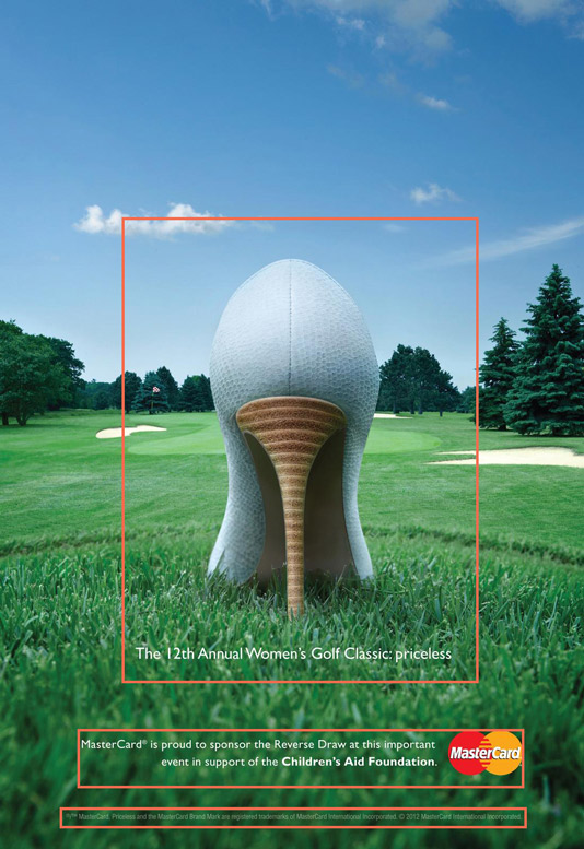
4. Proximity– The ad’s related elements are grouped in nearer proximity to show their relationship with each other. The heading text is placed near the shoe for a more eye-catching effect. There is also distance with the other texts to help viewers distinguish the information and relationship of each sentence/paragraph. Lastly, the image has plenty of white space to help the viewer’s eyes rest.

5. Color– The color scheme used in the ad consists of analogous shades and tints of green and blue. The color of the sky is parallel to the light blue shoe. Similarly, the green shades of the trees and the grass blend well to entice a viewer’s eye. Overall, the nature-inspired color scheme invites feelings of tranquility and encourages thoughts of relaxing in nature.
Conclusion:
The ad is a good example of showcasing the five basic principles of design. The relationship between the ad’s contrast, alignment, repetition, proximity, and color show an excellent balance of visual appeal. Also, it’s important to note that the shoe’s pattern shares a similar design to that of a golf ball’s exterior, and the shoe’s heel to a golf tee, which makes the ad more effective. The ad’s minimalist design is what makes it very powerful and clever.
