
The image above is a magazine spread from Gardeners’ World. It will be used to analyze the design elements such as the typography and the photograph that was used. The link to the image preview can be found here: https://reader.magzter.com/preview/ssorovbk07au3be6xz96y93424960/342496#page/2
Gardeners’ World official website can be accessed here: https://www.gardenersworld.com/
All credits go to:
Article Writer/Editor: James Alexander-Sinclair Magazine Publisher: Seymour Distribution Ltd
The Analysis:
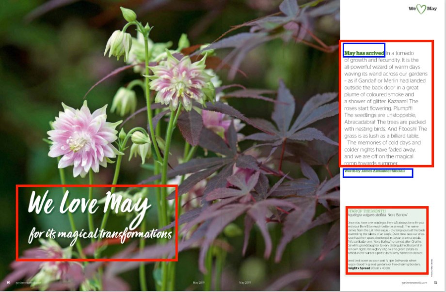
1.Category Identification- The magazine spread uses different typefaces to reflect variety. The text below the flowers uses the script typeface to signify the heading and subheading. The texts that are written on the right section uses a slab serif and a green font to indicate importance. A black sans serif typeface is also used for the main body texts.
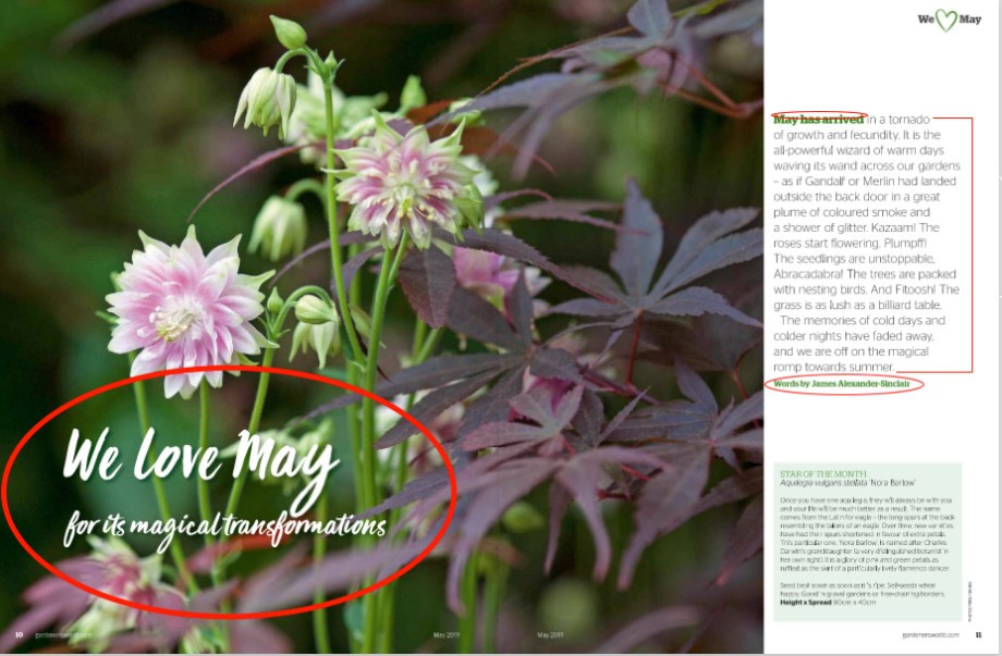
2.Typeface Contrast- The contrast in this magazine spread is achieved and shown in different ways. There is a clear distinction in each of the texts’ size, weight, structure, direction, and color. The heading “We love May” and its subheading both have the same typeface. They are made larger to further emphasize text hierarchy. Some of the texts are also stressed in bold and italic to demonstrate stronger contrast. Structure contrast can also be clearly seen by the differences in each typeface’s serif, thickness, and form or how each letter is built. Furthermore, there are also obvious differences in color such as the green, white and black font. Finally, the direction of the texts are all positioned horizontally to counterbalance the image’s vertical direction.
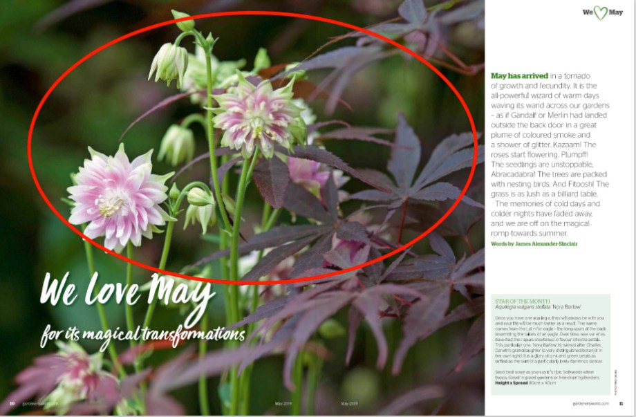
3.Photography- It is clear that the image used the principle of the depth of field. The focal point is emphasized by blurring the background. It is also zoomed in to show its details more vividly.
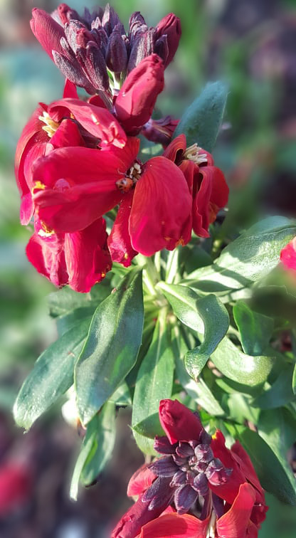
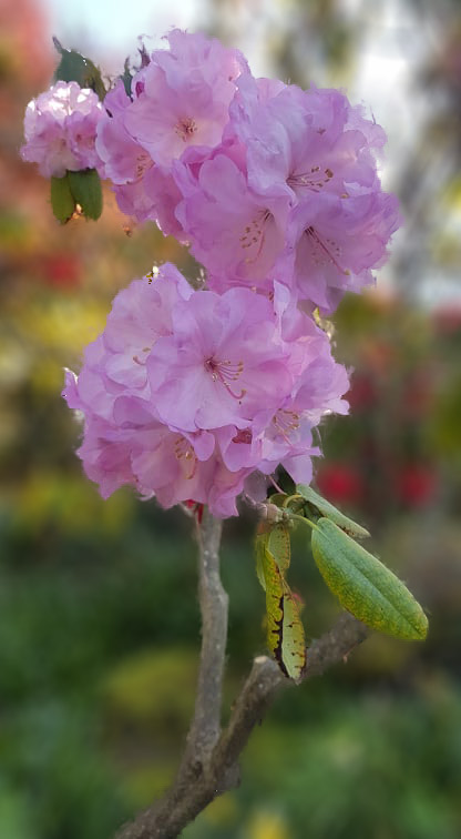
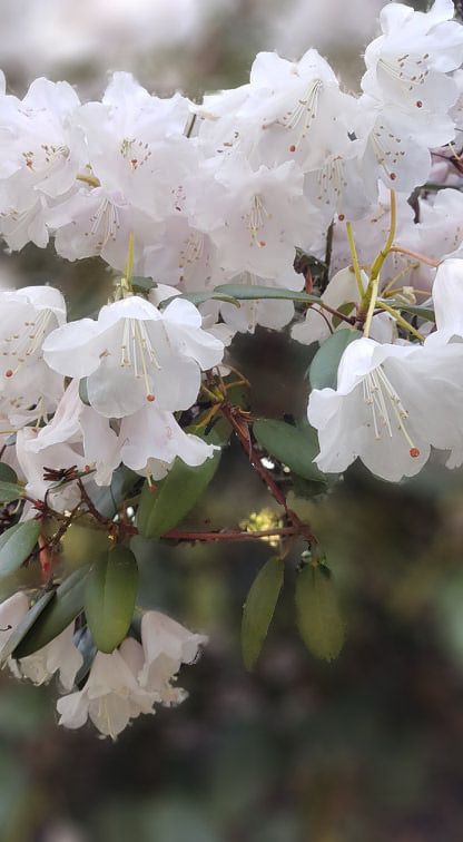
4. Alternative Images for Layout- These are the images I took and chosen as alternatives to the magazine spread. Since the main subject is about flowers, I centered around taking pictures of different types of flowers in various places. I also utilized the depth of field by mimicking and blurring the background.
Summary:
The magazine has clearly utilized the different principles of typography and photography in a compelling way. It has used at least two or more different typefaces to show variety without making any element incongruent or conflicting to the main subject. The photograph used also communicates a very clear message to the viewers and has used the principle of the depth of field effectively. Overall, all of the elements and principles used to create this magazine spread have a clear relationship with each other.
